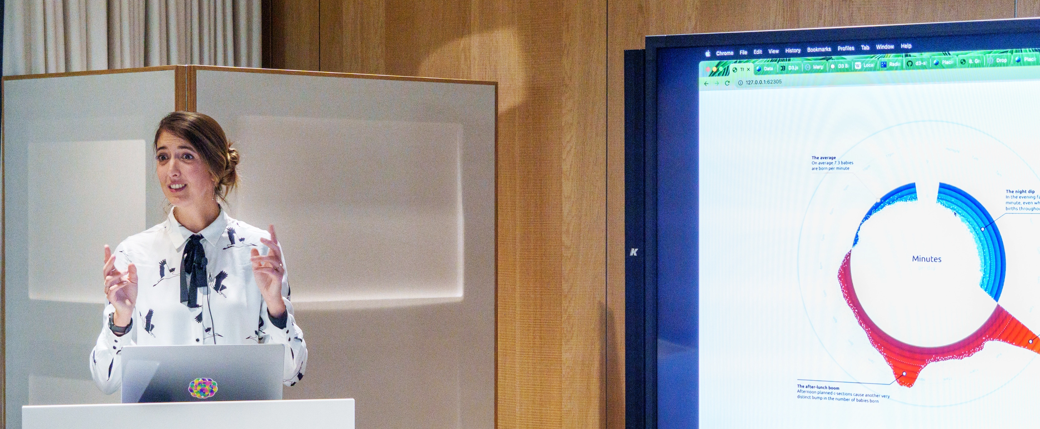
When it comes to visualizing data, art is not the first thing that comes to mind. Nadieh Bremer has taken a path in which she can combine those two things. With aesthetic data visualizations, she illustrates rather boring facts and figures in fascinating yet clear representations.
Why is data visualization so important?
Nadieh Bremer: I think that's because humans really are visual beings. We take things visually. If you show a person a chart of numbers, they don't know what to make of it. But if you showed that same sort of set of data as a line chart, they can instantly see who is doing best or what is the general trend. And also, we can remember how the chart looked like much longer afterwards. Like the idea that one picture says more than a thousand words. I think that's why data visualization is so important in this world where we have a lot of data and improve how we do things with data. Because of that we as humans need to visualize that data to understand the training patterns and the stories that the data tells us.

Right, and to do that you have to use storytelling. We mostly know it from writing. How do you use storytelling for your data visualization?
Storytelling in data visualization is generally about setting things up by steps. So instead of showing the entire visualizations at once for example you first set the scene in a way. You explain, well, we have this data set, where it comes from, what am I going to tell you about it. You then introduce the axes for example. What do the colors mean? Take one example from the data and then explain that in a lot of detail. How should I see this? What does it mean? What is the implication? And then reveal maybe all of the other data that people are then gradually introduced into the story that you're trying to say. And that's kind of the idea of the storytelling behind data visualization.
Where do you see potential at Swissgrid in data visualization?
I think they're already very much ahead of the curve for the fact that they have data in their office that's pretty new. So, I'm really happy about that. But I saw the control room, which has a lot of data on its walls and I think there's definitely potential there to make all of these different visualizations sort of more meshed together. Right now, they seem like a lot of separate charts. And I feel that if you look at it from a different angle, you could show that information in a more linked way by showing it visually in a different way. But I'd say that 99% of businesses and what they have in terms of data visualization that are around these days can improve their data visualization because it's really such a new field. And it was always seen as something that you have to do on the side. If you do something in Excel, you can create data visualizations. And only recently in the last few years, businesses have understood that data visualization is a skill, and you need some specialists if you want to do it right.

And any trends in that?
I'm not quite sure if there are trends, but there's a lot of learnings going on again because it's so new. In the start it was almost all line charts and bar charts. But now we're understanding that for a business dashboard for example you have a completely different goal than for a magazine. We’re understanding what works best for different audiences. There are different rules that best work to create a good data visualization for a newspaper or something for marketing. And I think the thing is that we're just getting much more knowledgeable about these different areas and what kind of data visualizations work in these different kind of areas or why they don't work in other places.
What do you do in your spare time to live your passion for data visualization?
Um, actually, one of the things that I did in the last year was something called the Fab Academy, which is a 20-week course where I learned how to be a maker. So, I worked with laser cutters, saws and 3D printers to actually make physical things and physical data visualizations, which I hope will be something I might be able to do in the future. Creating physical data arts, you know, work with wood and with cardboards and other materials and making data visualizations that way. So that's also how I try and do data visualization through other things.
Have you already done that for clients?
No, actually I haven't yet. I mean, data art is hard to sell, but physical data art is even harder.
Author