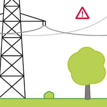
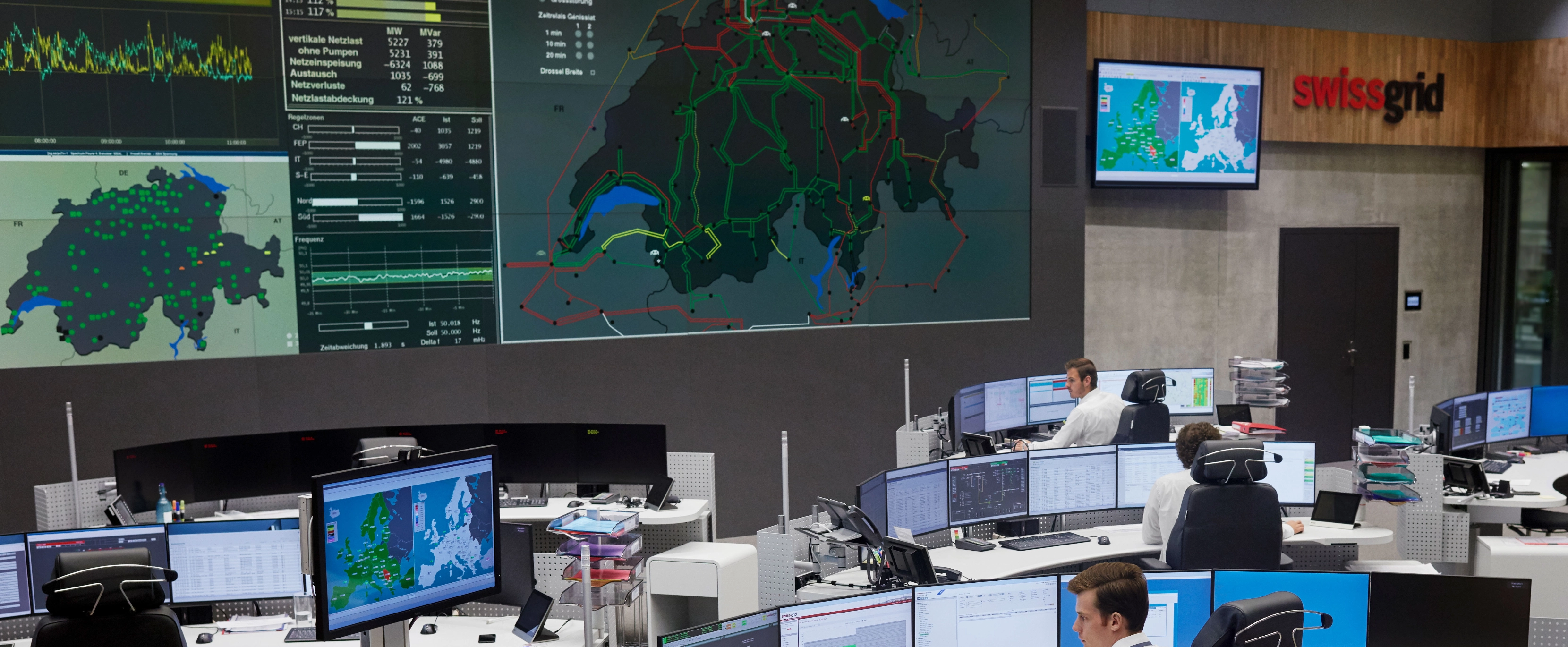
6,700 kilometres of lines, 12,000 pylons and 141 substations – the Swiss extra-high-voltage grid is a complex web. This becomes particularly apparent when it is to be represented graphically, which is why Swissgrid is on a constant search for new and simplified representation options. This is important so that the operators in the grid control room can identify the state of the grid as quickly and intuitively as possible. They also need to simulate and demonstrate a range of situations and incidents in the grid. Swissgrid uses these simulations to ensure that it can respond quickly and correctly to overloads or outages.
Every second counts in an emergency, such as if a line fails or the grid stability is at risk: the operators must be able to recognise what is happening in the grid as quickly as possible. They need to analyse the problems and develop solutions, all of which is made easier by the clearest possible representation of the grid.
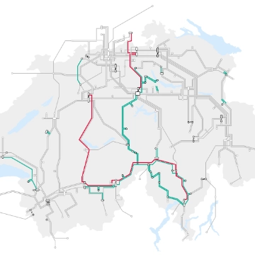
For a pilot project which is part of the R&D project «Data Visualisation », Swissgrid employees created a schematised grid map.

Breaking the rules brings about progress
Just over a month after the idea had been presented to the R&D team, a small group of experts were able to tackle a simplified representation of the Swiss extra-high-voltage grid. The group included a Senior Application Specialist who, as a former operator in Grid Operations, is very familiar with the conditions in the extra-high-voltage grid and undertook further training in visualization technology, as well as a qualified machine draughtsman who now works as a Digital Media Manager and has an excellent grasp of design software.
Together, they clearly visualised the entire grid to enable a better and more intuitive orientation for the specialists in the grid control room. This required some of the rules to be abandoned. For instance, the topography of Switzerland was not precisely represented. In the new representation, the lines run only horizontally, vertically or at a 45° angle. Line intersections were eliminated wherever possible, densely packed areas expanded and better use was made of areas with fewer lines. In addition, line symmetries were established, and the course of line rings was made clearer.
Another rule that the expert team broke was the colour of the 380 kV lines. These lines had previously always been red. Red is a signal colour and is no longer used when the grid is in its normal state in the new representation. This naturally makes it possible to expand the range of signal colours, with yellow and orange for example. Irregularities in the grid can now be divided into clear priority levels that can be easily identified by operators in the grid control room.
Modelled on the Tube Map

Inspiration was taken from the network map of the London Underground. It was designed by Harry Beck, a technical draughtsman by trade, in the 1930s in his spare time. His idea: to forego topographical accuracy in order to enable a clear representation in the «tube map». This was used as the basis for creating the simplified schematic representation of the transmission grid. It allows the eye to find its way more quickly and identify problem zones in the grid much more easily.
The original representation continued to be simplified over countless steps. It became apparent that the topography of Switzerland cannot be ignored completely in order to quickly understand the grid situation, as the employees in the grid control room have spent years using national borders, towns and cities, lakes and important substations as guides for orientation. This has established itself in practice and flowed into the considerations in the new representation.

This new representation creates a foundation to which additional elements can be added as required. For example, the supply regions of the distribution system operators can be plotted more easily, natural hazards can be integrated if necessary, and electricity flows, grid disconnections, line loads and many other data can be visualised.
An R&D pilot project will now be used to integrate and interactively visualise operating data in the map, such as an animation of the power flows along the lines. Just one more way in which modern data visualisations can support efficient operational decisions.
Author