
Electricity is the lifeblood of our modern society; it drives us silently and invisibly. We only become aware of its presence or absence when it stops flowing. It always takes the path of least resistance; to make it tangible and depict it seems impossible. Not so for Nadieh Bremer. The Dutchwoman is an independent designer in data visualisation and an artist with a background in data science and a degree in astronomy. Swissgrid asked her to take on the Herculean task of literally making the flow of electricity visible with her work «Landscape of Power Flows».

«In the flow» is certainly the right expression here. When viewing the visualisation from a certain distance, the first thing you notice is the red colour. Sometimes more pronounced, sometimes less, the red creates connections between circles of different sizes. One circle seems to want to set the next in motion. You can clearly see the interconnectedness as well as the interdependencies. Only together can they keep the momentum going. Where the red colour stops, you can see outlines. You are left in no doubt that the shape they form is Switzerland. If you move closer to the work, the names of villages become recognisable: Avegno, Chamoson, Innertkirchen, among others, can be made out. Anyone familiar with Swissgrid's infrastructure knows that these are its substations. They also seem to be on the move. Rings pulsed around them like a heartbeat. Behind the beauty of this work lies a vast amount of data, which Bremer has painstakingly brought to life. More specifically, it is 2019's operational data from the extra-high-voltage grids, called grid models, which Operational Planning generates and uses. This dataset comprises somewhere in the region of 60 million lines.
From the big picture down to the detail
Bremer also approached her demanding work step by step: «The scale of Swissgrid's data is unimaginable. The challenge was to find the right granularity, i.e. which data do I map and which data can I aggregate for this purpose». She describes the first step of her work as a kind of immersion in the flood of data. Once immersed, she tries to establish connections between individual elements and datasets. This produces cleaned data from the raw data, which she can use for visualisation: «I start to process the new dataset in my head. When doing so, I think about how to present it so that the information is easily digestible and easy to convey.» Bremer soon had an idea of how she could map the network data over the span of a year. She has always aimed to create a work that is aesthetic, appeals to people and unfurls its effect from a distance as well as up close. However, she not only wants the visualisation to be «beautiful», she also wants to be informative, highlight trends, present insights and draw the viewer's attention to the complexity and richness of the data with which Swissgrid's system operation deals on a daily basis. As an expert, she knows: «Especially in view of the vast amount of data, visualisations help us better understand the context and make decisions accordingly.»

More than just art for art’s sake: from the work of art into everyday life
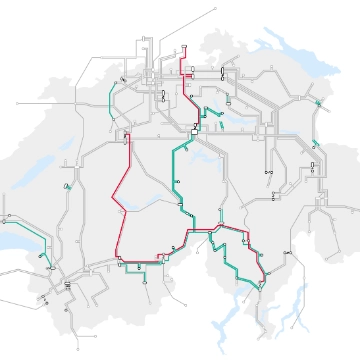
As a transmission system operator, Swissgrid's world comprises numerous networks and a huge amount of data, which it exchanges with its partners at home and abroad. Important decisions and interventions in the system are also based on data. More data and information is available than ever before. Hence new simplified representations which disentangle complex relationships are also essential for Swissgrid. This is true especially for Swissgrid's beating heart: the grid control room. The operators have to identify the state of the grid as quickly and intuitively as possible. After all, in an emergency, for example when a line fails or the stability of the grid is threatened, every second counts. Swissgrid therefore works more and more regularly with data visualisations. One example of these is the schematised network map, which was created from the same operational extra-high-voltage grid data as the «Landscape of Power Flows» work. As this shows, the possibilities of data visualisation seem almost inexhaustible, be it from a creative point of view or with an informative focus. Bremer is personally more attracted to the challenge of implementing data in an artistic manner. Swissgrid is more than impressed with her work. It therefore decided to print «Landscape of Power Flows» in large format on acrylic glass and display it in the main building in Aarau. Let us hope that the situation will soon allow it again and that the work will invite numerous employees and visitors to look at it from a distance and to read it up close.

Author